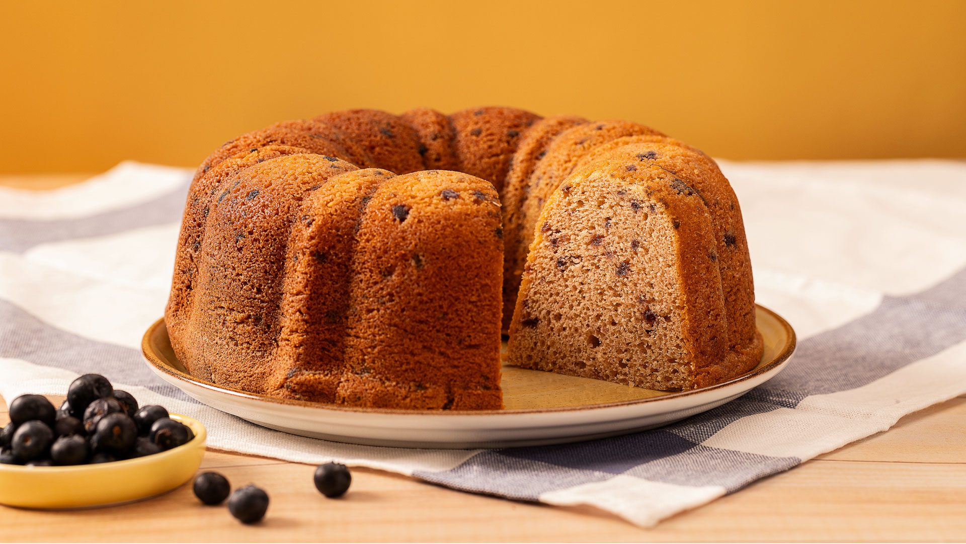
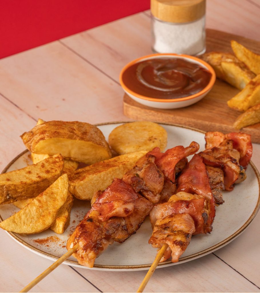
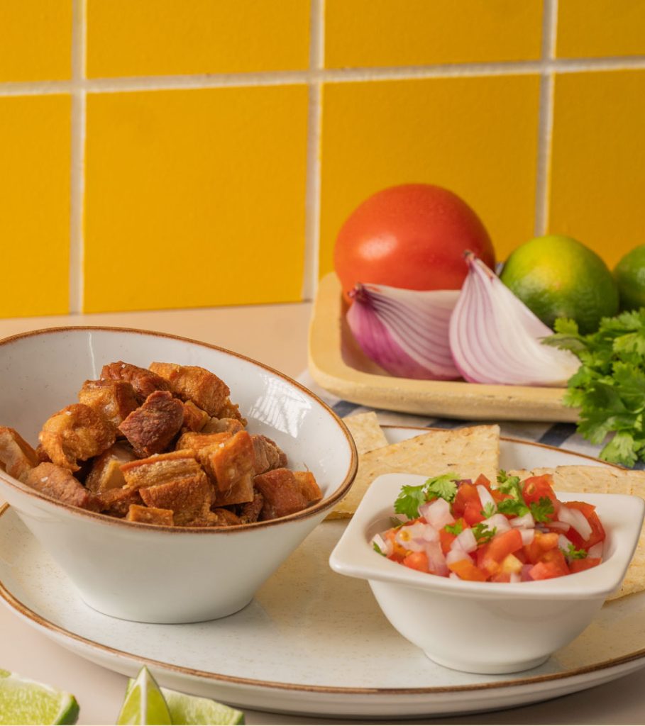
Pan y Parrilla was born as part of the OR experience: that special place where people enjoy a delicious bite on market day. Initially created as a complementary section to offer fresh bread and simple dishes, it quickly became something more. A proposal so beloved and flavorful that it began to claim its own identity within the brand’s ecosystem.
2. Brand Psychoanalysis
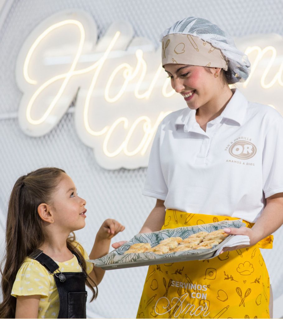
At Self, we understood that Pan y Parrilla wasn’t a separate brand, but rather a meaningful expression within the OR universe. Its personality needed to reflect the joyful, welcoming, and warm character of the parent brand—yet with a flavorful, straightforward, and unique voice of its own.
We shaped a close, everyday tone of voice that evokes the joy of homemade food, the smell of freshly baked bread, and the simple pleasure of staying just a little longer.
3. Strategy
From both a visual and verbal strategy, we gave Pan y Parrilla a leading role within the OR brand system. We created a graphic universe of its own, emphasizing the color yellow as a focal point within the broader chromatic architecture. We made the space visually striking, developed all key messages, activations, launch materials, and signage. We also supported its evolution as a brand with its own identity—without losing coherence with the whole ecosystem.